Responsive Design for Your Inbox
Who doesn’t love getting mail? Email from your subscribers has finally become easier on the eyes. Last month, Google announced that “Gmail and Inbox by Gmail will support emails created with responsive design, meaning their content adapts to fit screens of all sizes.” The update includes Google’s three webmail clients: Gmail (iOS & Android), Inbox (iOS & Android), and Google Apps. Designers, developers and savvy users are rejoicing over this ‘ah-ha’ moment for responsive design.
Not familiar with responsive design? If you are on a laptop or computer right now, grab your browser and resize it from skinny to wide, and you will see responsive design in action. A blog, website, or email shouldn’t need dedicated layouts that require refreshing, redirecting or large files in order to look great at all times. Resizing should happen automatically as the size changes. Responsive design is in full force with hopefully the majority of websites out there, and now Gmail has allowed this magic to happen with emails.
Emails have been tricky to view in the past, only designed specifically for desktop or mobile devices. Mobile users have experienced inconveniences during this transition – like the need to zoom in closer to see a photo or headline clearly – because it was meant for desktop and the display is too small for a phone. This responsive support especially applies to emails that look like small web pages, and ideally will fix other common issues.
Google’s effort to expand CSS support gives email designers more control over how their messages are rendered. (CSS, or Cascading Style Sheets, describe how elements are to be displayed. It saves a lot of work and by controlling the layout of multiple web pages all at once.) These CSS rules have very useful media queries supporting responsive design.
Google’s media query support features include:
- Orientation, you optimize the landscape and portrait views of your email
- Min-resolution, which is helpful for applying retina assets
- Text, links and buttons will enlarge to make reading and tapping easier on a smaller screen
- Content displayed better and spaced more appropriately
Finally, email is how it should be – adapting to the device from which you are viewing your email. Users are experiencing easier reads, straightforward actions, and appropriately sized elements within messaging. Brands are sending out messages that are formatted with intention — whether it’s viewed from a desktop, a tablet in landscape mode, or your phone in portrait mode. The importance of how messages are displayed makes email design a priority. Gmail promised to make it easier to design emails that will look great across all its clients, allowing more time for focusing on the many other aspects of email marketing.
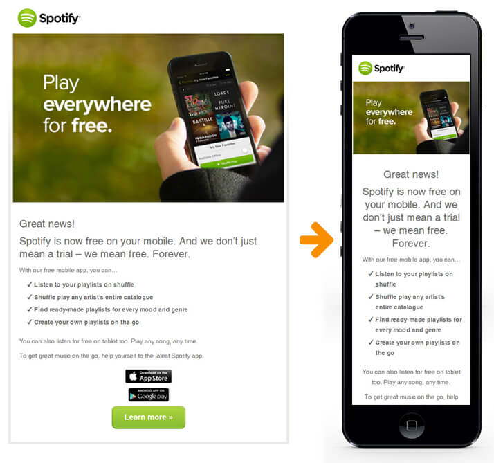
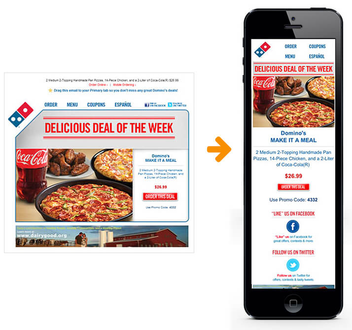
Here are a few executions of well-designed responsive emails:

Categories
Recent Posts


Related Posts